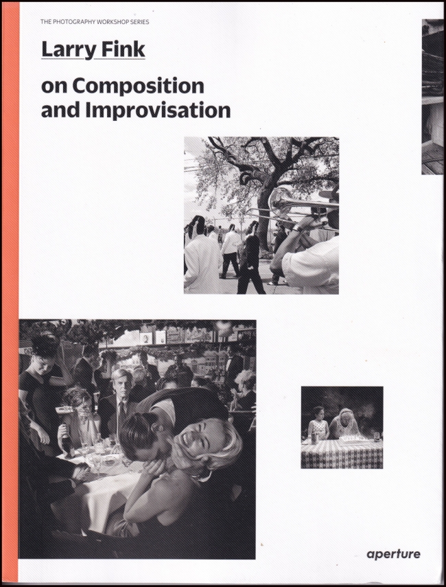
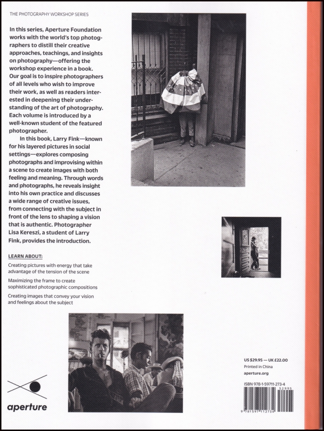
Last January I posted my thoughts on another of the books in the Aperture Photography Workshop Series (See: On Street Photography and the Poetic Image). I really liked that book and decided to get some more in the series. As of today I have all but one of them
Unfortunately I didn’t like this book as much as I did the last one.
While most of the reviews on Amazon are positive, even glowing one review says:
I don’t know about the author before purchasing this book, I purchased this along with the other one written by Alex Webb in the same workshop series, so I thought it would be a promising book for composition inspiration. After reading the first 30 pages, I realized this book was kind of a joke. But i told myself to continue as the author got his fame on this for reasons and I need to read more to understand that. Until the end of this book, I almost didn’t find any really excellent photographs that deserve a thorough study. All of the photos inside are black and white, shot in photojournalistic style and quite a bunch were shot with flash. To me, a good candid or photojournalistic photo needs to have something that leads your eyes and keep them there, it may be some interesting light, some exotic juxtaposition, some decisive moments or something that you can smell out of it. But most of the author’s works shown in the book are not that interesting at all, some of them have really flat or bad light, harsh flash illumination, poor crop of human bodies at the frame edge or corner as well as no real moments existed there. And the author’s explanation in the excellence of his works are also confusing and not convincing. It looks like the author randomly made the incomplete crop or object inclusion when clicking the shutter, and then figured out some academic reasons or principles from nowhere to make these stuff sound like magic and then persuade you to follow and study.
Examples like Page 26, the author emphasized the importance of the table edge at the bottom left corner of the frame, which brought out the 3D feel of the image. To me, it’s like a redundant and incomplete composition, I would clone it out in PS without a second thought. If you want a 3D look, use the side lighting to shape your subject to bring out the texture of dimensionality instead of introducing unnecessary distractions into the frame, like the table here which has nothing to do with the central theme of the photo – the boxer. Other works like page 34, I even can’t figure out what that image is talking about, what are the roles of those people and what are they doing. The author seemed to be quite proud about the compositional arrangements in this photo, but I can’t find any interesting arrangements here, as well as no real moments can be discerned. It looks like a common snapshot, and if it is thrown onto the internet anonymously, I really doubt it will draw any attention from the public. Same thing for page 35 and a lot more pages in the book. At page 99, the author seemed to be quite excited to have a “lucky” photo, which to me is similar to a boring selfie photo bomb in today’s instagram. The main subject the author trying to photograph is a black student, who situated in the center of the frame in big proportion, emotionlessly, disinterested and only god knows why the author thought he was interesting enough for him to click the shutter. The other two silhouette students at the right side talking to each other, also cluelessly and had no obvious business with the main character in the center. The background is another black boy’s face bumped right out of the main character’s head, which is a failed composition in any common sense, or at least nothing special in my mind. And now the highlight came from the boy at the left, who laughed and waved his hands hysterically, staring at the camera and the author (the photographer). So what is this image all about? I didn’t see any good compositional or improvisational merits here. All I see is a common and random image taking phenomenon: You walked in a street and suddenly came across a beautiful lady, and then you quickly lifted your camera at the same time threw harsh flash light from your side on her face, only finding that the moment you clicked the shutter her daughter from behind was making a face towards you. Is this really a good photograph that worth your 2nd look? Is this a photo that deserved to be shown in a photo book or in a museum art exhibition? I doubt it, and I simply can’t understand it.
There are too many unconvincing ideas, instructions and explanations in this book, most of which is not practical or relevant to the title. I really can’t figure out how the author got great fame or his senior academic positions in photography, which is also a big mystery to many of my professional photographer colleagues after my showing them the works and the words in this book. Maybe we are too “young” to understand the art, but if I can easily appreciate and learn from lots of the other admirable photographers’ works such as those from Magnum Photos, I believe the author is simply incompetent in certain ways here.
Since this book looks more or less a best seller in this category on Amazon so far, I seriously wonder if anyone who purchased this book had the similar doubts but can’t or not dare to admit. Personally, I would strongly not recommend this book for educational purpose as it doesn’t show you any usable or practical compositional knowledge and skills as well as not exhibit any great examples falling in this aspect. It may be a good purchase or inclusion for any fans of this author’s works. I truly believe photographers such as Constantine Manos, Steve McCurry or Gueorgui Pinkhassov from Magnum Photos are more suitable for this book, their works and technical skills in this part is at least several light years better than the author, unabashedly.
And another one where the author is much more positive towards the images, but takes exception to the language:
First this is NOT a photo workshop book, as the title implies. I’m a teacher and hoped to get something to share from it; but no.
The book is a collection of photographs by Larry Fink, with short texts that vaguely relate to his process.There are two major problems with this volume:
1. The photos, while certainly good, or above average, lack greatness. It seems that Fink has mastered a good composition trick; he knows how to shoot a multi-layered image really well; but unfortunately that’s all you’re going to get as he repeats the same trick over, and over, and over.
But in terms of voice, no one is there. It’s hard to explain in words but these pictures lack soul. To give some perspective, the work of Diane Arbus oozes with soul. There’s nothing like that here. There’s not one image where, as a viewer, I’m intrigued by the people he shoots. Which is really strange. Fink speaks a lot about empathy, but it’s not clear he understands what this means by looking at his images.
But it gets worse . . .
2. What’s really frustrating is how pedantic the author sounds throughout the book. It seems that he purposefully uses overly complex language to make his work more interesting.
Here’s a typical example, p 81: “There’s a difference between atmosphere and space within a picture. Atmosphere is charged space; it fills the setting with feeling and could come from the way you feel about the place—something from within your mind—or from physical conditions. Either way, it is worth trying to emphasize the factors in the reality that creates atmosphere . . .”
Sounds smart-ish . . . But what does it mean exactly? Not much.
Throughout the book, he sounds like a New Age guru . . .
p 83: “This is not technique. This is the entryway to the soul.”
p 73: “I’m not analyzing my desires to the point of cooling things down—just to the point of understanding impulses as they come.”
p 69: “I’m a volatile feeler. I don’t live in automatic mode . . . It’s the idea of merger—inter-organic merging with other energy forces.”
This whole thing sounds like terrible 70’s psycho-babble.
But the problem may not come from the artist but from the editor, Aperture (who mis-titled the book).
It’s the second time I received a bad book from Aperture. The first was the Aperture anthology — which was again incorrectly titled as it was not an anthology but a collection of essays.
No more Aperture books. This one will be returned because, to use the words of Fink, this “inter-organic merging with other energy forces” is not quite working.
If you love photography (without the pedantic jargon), please avoid this one.
Although I agree with a number of his comments, I think the author of the first review is a bit harsh. There are about 75 pictures and I like about 22 a lot. But please take this with a grain of salt. I don’t incline to this type of photography and in all likelihood don’t understand it that well.
I agree more with the second review, particularly his second point where he says “What’s really frustrating is how pedantic the author sounds throughout the book. It seems that he purposefully uses overly complex language to make his work more interesting.” While I don’t know whether he consciously tried to use “overly complex language” to “make his work more interesting” the language is somewhat tortured. It’s not the worst photography book I’ve ever read, but it’s far from the best. I don’t regret buying it.
You can find more information (e.g. publication information as well as more reviews) on Amazon.com where I purchased it. What you can’t do, at least for the moment, is purchase a copy for yourself and Amazon says: “Currently unavailable. We don’t know when or if this item will be back in stock.” It doesn’t seem to be available on ebay either, and it’s listed on the publisher Aperture’s site as “unavailable”. Must be popular?


